BRIEF
Finanças Femininas is the largest female financial education online platform in Brazil. After almost a decade on the market with a very traditionally corporate look and a very male dominant structure and aesthetics, they came in wanting a very bold and contemporary makeover. From the get-go, they wanted something that could represent them as the powerful top of market platform that they are and the founder as the charismatic character that she is, with a very special focus on the united community that they’ve built. Their followers are called “ Poderosas”, which means something like “Powerful Ladies”.
SOLUTION
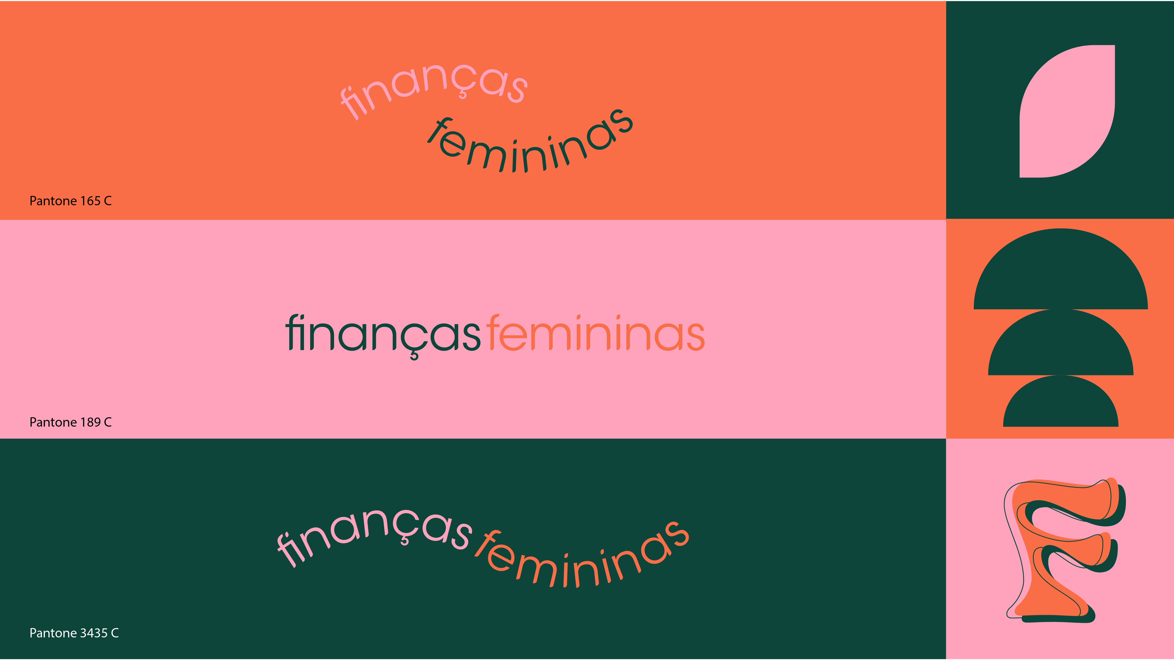
Firstly, we’ve identified who their target audience was and how the platform’s influence impacted their online community. With that information, we were able to understand which branding assets, values and elements needed to stay, and what needed to evolve. We could also see clearly how important it was to represent the different targets inside their own community. Be it the 40 year olds with lifetime financial challenges, or the young woman wanting to conquer financial independence and conquer her own life, or even the ones who were constantly in dept, there are these very remarkable “poderosas” that trust and support the platform. So with that, we came up with 12 different “F’s”, each for every type of “poderosa” , always trying to match the “F” with their personality. We’ve also brought in patterns and graphic element such as the seed to represent the management of your financial investments and the tree that means the fruits that come with it.